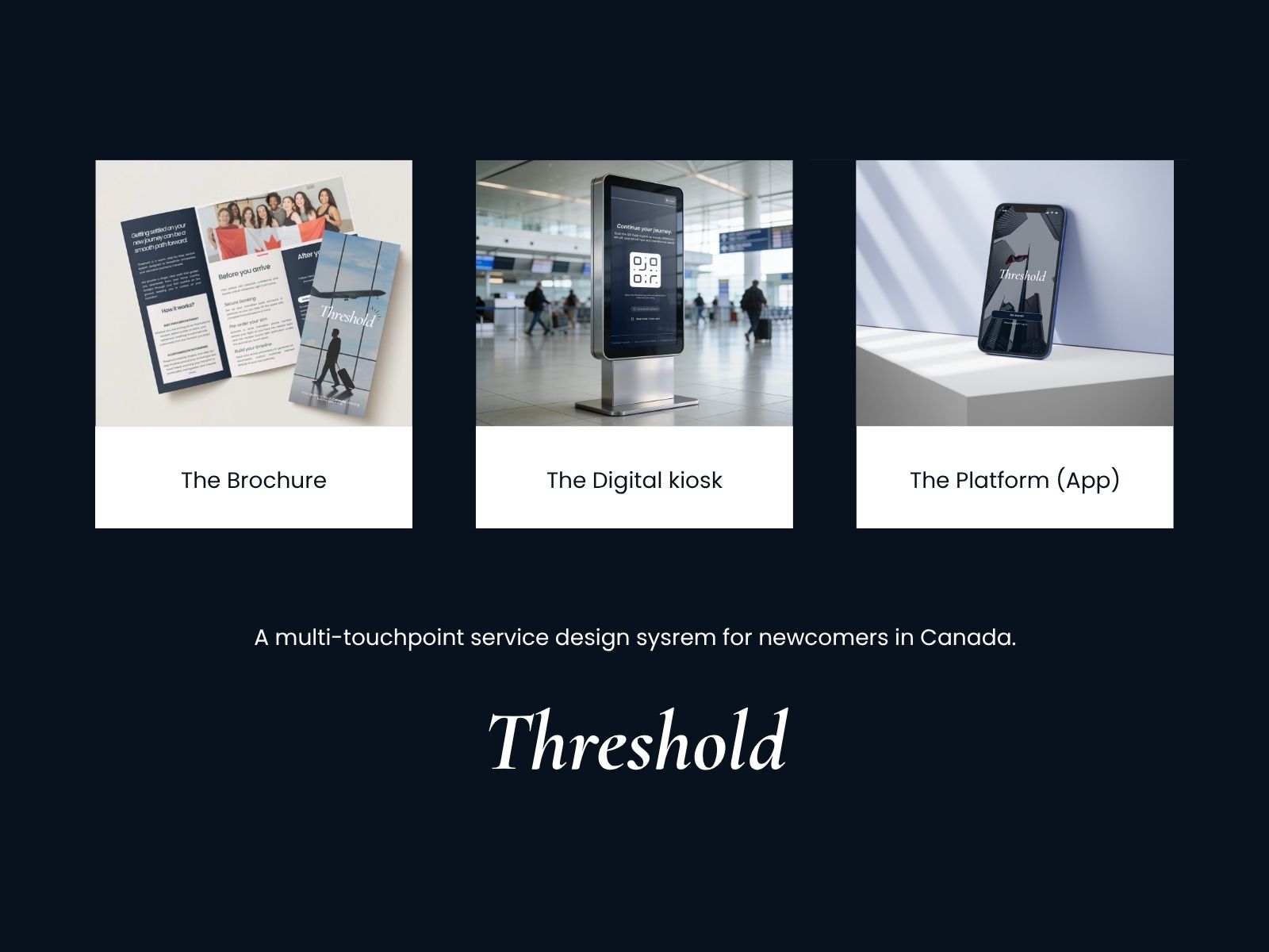
relied on friends and family to figure out what to do after arriving.
01 · The problem
The information exists.
The guidance doesn't.
Landing in Canada comes with an invisible checklist: SIN, banking, a phone plan, housing, transit, health coverage, and eventually taxes. The information for each task exists, but it is scattered across systems that do not explain what applies to you, what comes first, or what depends on something else.
The problem first became visible through lived experience, then kept repeating around me. I arrived prepared and still learned critical steps through conversations with people who had already gone through the process. After I settled, newer arrivals in my immediate community began asking many of the same questions, whether to me or to others who had already figured things out. That repetition made the gap worth investigating beyond any one person's experience.
SINBankingPhoneHousingTransitHealthTaxes
Different systems. Different rules. One newcomer trying to connect them.
02 · Research
I needed to understand where the system was breaking down.
I used interviews, survey data, competitive analysis, and secondary research to understand recurring settlement patterns, how people currently find help, and where existing services lose them.
The goal was not just to confirm that settlement feels confusing. I needed to understand where the confusion started: what people prepared for before arrival, what caught them off guard after landing, which resources they trusted, and which tools failed to meet them at the right moment.
15survey responses
3semi-structured interviews
5+direct competitors reviewed
Secondarygovernment + academic research
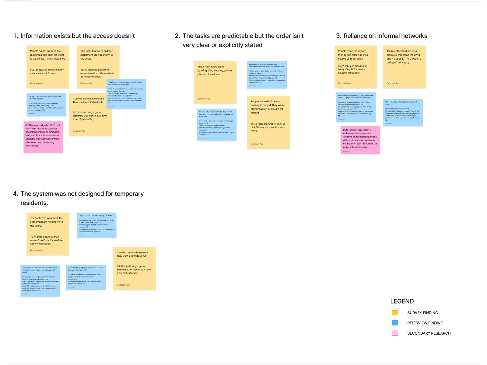
Across the research, the same breakdown kept appearing in different forms. Newcomers were preparing before arrival, but still discovering important requirements too late. Official resources existed, yet friends, family, community groups, and general search were doing much of the work of explaining what applied, what came next, and where to go.
Competitive analysis reinforced that gap. Existing services could provide useful information, checklists, or institution-specific support, but the experience was still fragmented across channels. The strongest signals were not simply that information was hard to find. They showed that people needed help interpreting it, sequencing it, and understanding which options applied to their own situation.
This shifted the design question from “Where can I put all the information?” to “How can a service guide someone through the right information at the right moment, even when they do not know what to search for yet?”
discovered useful resources only after another person told them they existed.
rated a single guided settlement platform as useful.
Add image · threshold-research-wall.jpg
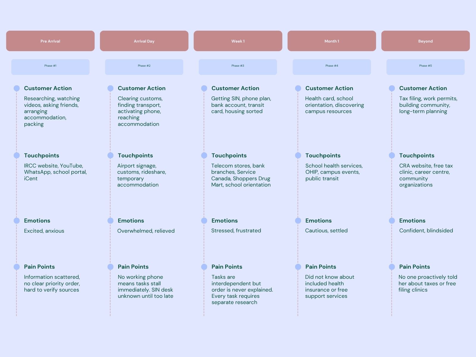
Add image · threshold-journey-map.jpg
“Every single time I turned around, there was a new requirement that I didn't know about.”
Interview participant · International student
Full documentation
View full research document ↗
The portfolio highlights the findings that shaped the product. The complete research report includes the methodology, persona, journey map, competitive analysis, survey synthesis, interview findings, literature review, and research wall.
03 · Research findings
Four insights became design requirements.
Prepared doesn't mean prepared.
People researched before arrival and still encountered gaps because the hardest problems were often the ones they did not know to search for.
Personal networks are the real infrastructure.
Friends, family, roommates, and community groups were doing the sequencing and interpretation formal systems were not.
Settlement is sequential.
Tasks such as getting a phone number, opening a bank account, obtaining a SIN, and securing housing affect one another. A flat list hides those dependencies.
Existing tools inform. They rarely orchestrate.
Competitors could surface useful content, but the opportunity was to guide someone through the right information, in the right order, at the right moment.
04 · From research to design
I translated findings into service decisions.
Research finding
People don't know what they don't know.
Design response
Proactively surface relevant tasks instead of requiring newcomers to know what to search for.
Research finding
Tasks depend on one another.
Design response
Sequence tasks and make the next appropriate action visible based on what is already complete.
Research finding
People trust people.
Design response
Pair formal guidance with a community layer shaped by language, background, and shared experience.
Research finding
A useful tool still fails if nobody discovers it.
Design response
Make distribution part of the service by placing Threshold at moments newcomers already pass through.
“Just a single platform that brings everything together. Somewhere that tells you, okay, you need to do step A, then step B, then step C.”
Interview participant · International student
05 · Designing the service
Three entry points. One continuing journey.
The touchpoints are connected, but they are not a mandatory funnel. Someone can encounter Threshold before departure, at the airport, or directly through the platform and still enter the same service.
Touchpoint 01 · Awareness
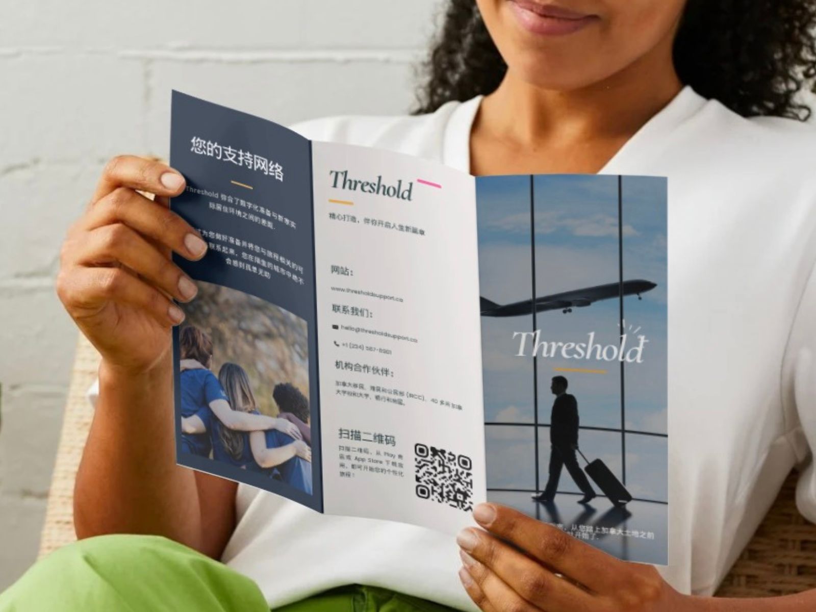
The brochure brings the service to people before they need to search for it.
Visa Application Centres are unavoidable pre-departure checkpoints for many newcomers. That makes them a strategic place to provide a Threshold service packet without asking someone to already know that a settlement tool exists. The brochure introduces the service early, surfaces options they may not have known were possible, and lets preparation begin before the flight rather than after landing.
Design decision
The trifold mirrors the settlement journey - Before You Arrive, Airport Arrival, After You Land - while the QR code provides a direct path into the platform.
Inclusion decision
The brochure is intended to be localized by country and language, responding to research that showed English-language information could still be inaccessible even when it technically existed.
Add image · threshold-brochure.jpg
Touchpoint 02 · Arrival
No download. No account. No signal required.
Arrival day was the highest-friction moment in the journey map. A newcomer may be tired, unfamiliar with the terminal, and still without a working Canadian phone number. The kiosk asks only enough to understand their arrival stream and what they have already completed, then returns guidance specific to that context: actions available right there in the airport, what they need to complete them, and what should happen next after they leave. A mobile-only service could not reliably do that at this moment because the access channel itself may not exist yet.
Language→Arrival type→What's done?→Immediate actions→QR handoff
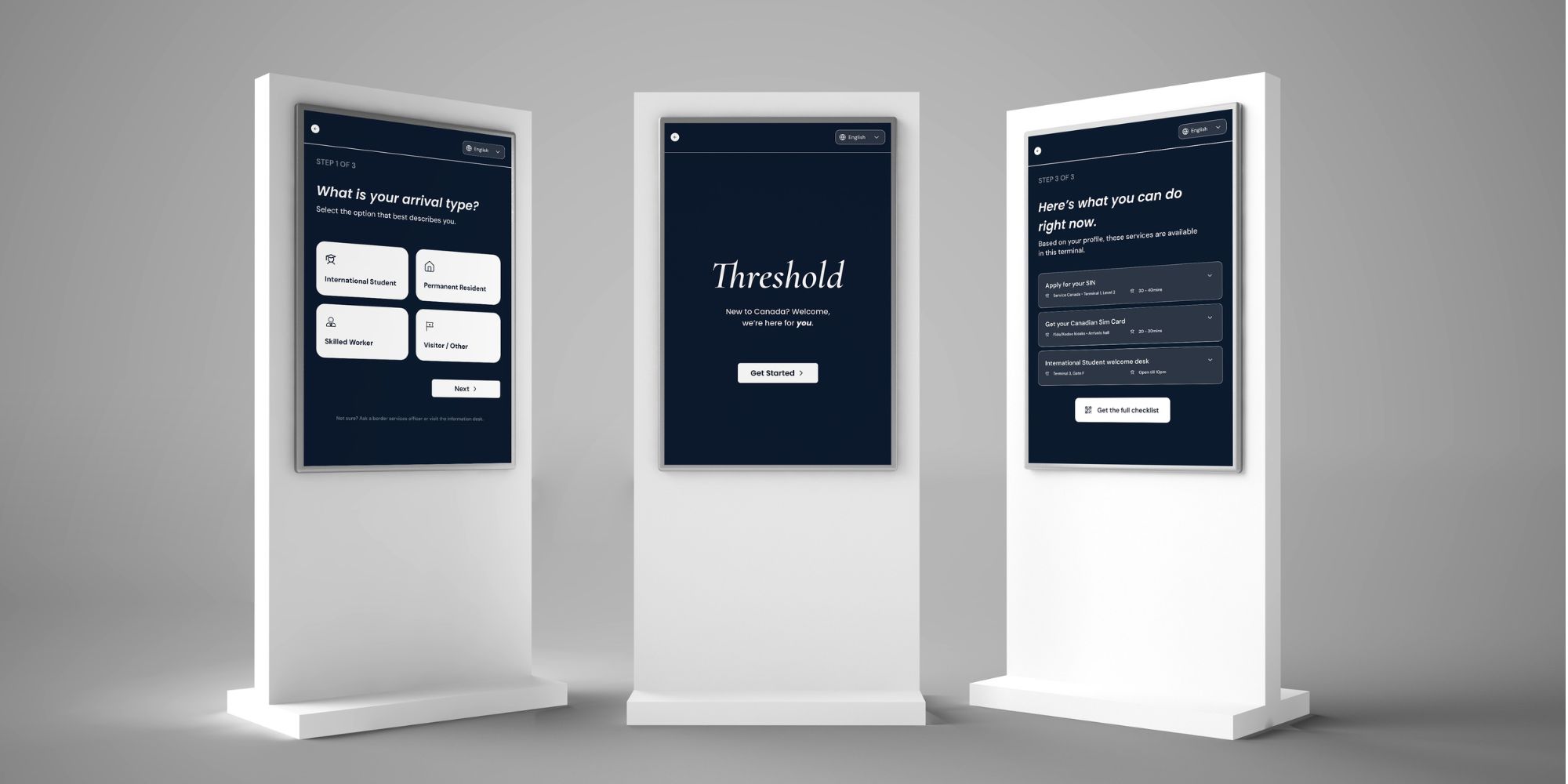
Add image · threshold-kiosk-screens.jpg
A typography decision I revised
Initial direction
Cormorant Garamond for kiosk questions
It carried the warmth and personality of the Threshold brand.
Revised direction
Poppins for fast scanning
In a public terminal, clarity at a glance mattered more than preserving the decorative type treatment.
Touchpoint 03 · Ongoing settlement
A journey, not a to-do list.
The mobile platform is the main service layer across Week 1, Month 1, and Beyond. It gives newcomers a personalized walkthrough, sequences what matters now, surfaces useful options, and keeps practical guidance, resources, and community support in one place.
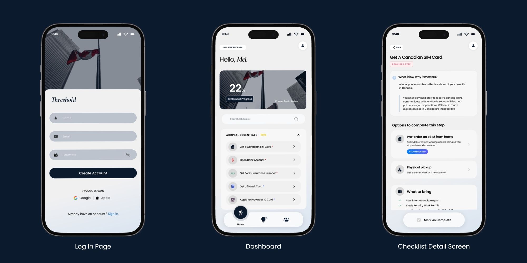
Add image · threshold-app-dashboard.jpg
Personalized onboarding
Arrival context shapes which tasks and resources are surfaced instead of giving everyone the same settlement list.
Sequenced dashboard
Progress, current phase, and the immediate next step make settlement feel like a guided journey rather than an undifferentiated backlog.
Task guidance
Each task explains what it is, whether it is required, what to bring, how to complete it, nearby locations, reminders, and practical tips.
Resources + community
Knowledge and social support sit beside administrative tasks because successful settlement involves more than completing paperwork.
A friction I caught in my own design
Why should someone create an account before Threshold has helped them?
The first flow gated the experience behind sign-up. I reconsidered that choice: a newcomer may be tired, on unfamiliar Wi-Fi, or unwilling to commit to another account before seeing any value. The revised direction lets someone begin with only their name; account creation becomes optional for saving progress across devices and deeper personalization.
BeforeOpen app → Create account → Onboarding
RevisedOpen app → Give name → Start
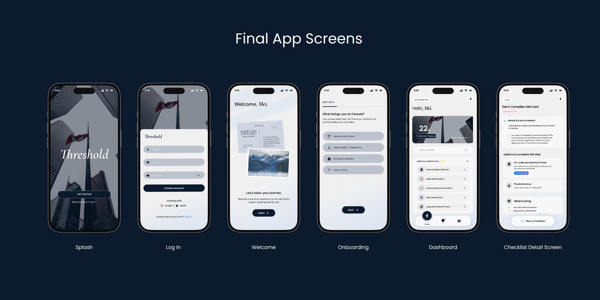
Add image · threshold-app-screens.jpg
Visual system
A calm, credible language for unfamiliar systems.
Threshold uses deep navy for trust and contrast, softer blue tones for support, warm off-white surfaces, Cormorant Garamond for selective brand moments, and Poppins for functional interface text where clarity has to come first.
Colour
Navy
#0C1A2E
#0C1A2E
Charcoal
#273348
#273348
Blue grey
#AEBBCA
#AEBBCA
Sky blue
#B9D6F2
#B9D6F2
Warm white
#F8F7F4
#F8F7F4
Typography
Cormorant Garamond
Poppins
Brand and emotional moments / Functional UI, labels, forms, and body text within the Threshold product.
Full documentation
View full design document ↗
The complete design report includes the full style guide, brochure rationale, kiosk flow, mobile platform, design revisions, and the detailed reasoning behind each touchpoint.
06 · What I would do next
The system is a proof of concept.
Testing is the next design phase.
07 · Reflection
Threshold taught me to design for the space between systems.
This project began as a question about scattered information and became an exercise in service design: where a service appears, how someone discovers it, how one touchpoint hands off to another, and how the experience continues without forcing everyone through one fixed path. The clearest principle I am taking forward is simple:
Don't just inform. Orchestrate.