Project overview
What is Zyra?
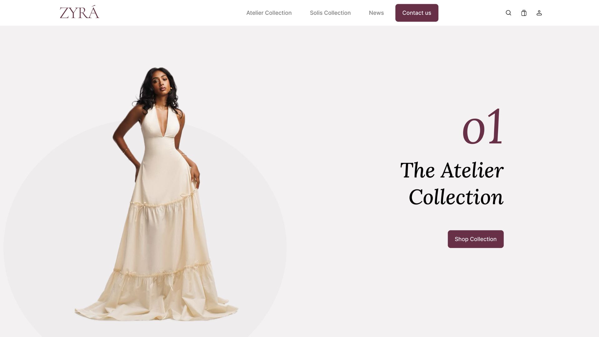
Zyra is a fictional luxury fashion and beauty brand designed to feel elevated, contemporary, and emotionally resonant. The design system was built to support a website experience that draws users in with purposeful motion, where content and hero imagery slide horizontally in and out based on scroll interaction.
The goal was to establish a scalable visual language: clear colour hierarchies, a curated type pairing, and a library of reusable components that any future screen or touchpoint could draw from.
Brand direction
Mood & Vibe
Elegant, feminine, confident, clean luxury. Zyra draws from editorial fashion: quiet opulence, sculptural silhouettes, and restrained colour. Every design decision reinforces the same feeling: refined without being cold.
Design tokens
Colour & Typography
Colour system
Brand
Neutrals
Typography system
Display / Logo: Cormorant Garamond
ZYRÁ
Headings: Lora
The Atelier
Collection
Body: Inter
Layout foundation
Grid System
A disciplined grid ensures consistent spacing and alignment across every screen. Desktop uses a 12-column layout with generous margins for breathing room; mobile collapses to 4 columns with tighter margins for comfortable thumb reach.
Desktop
Mobile
UI components
Component Library
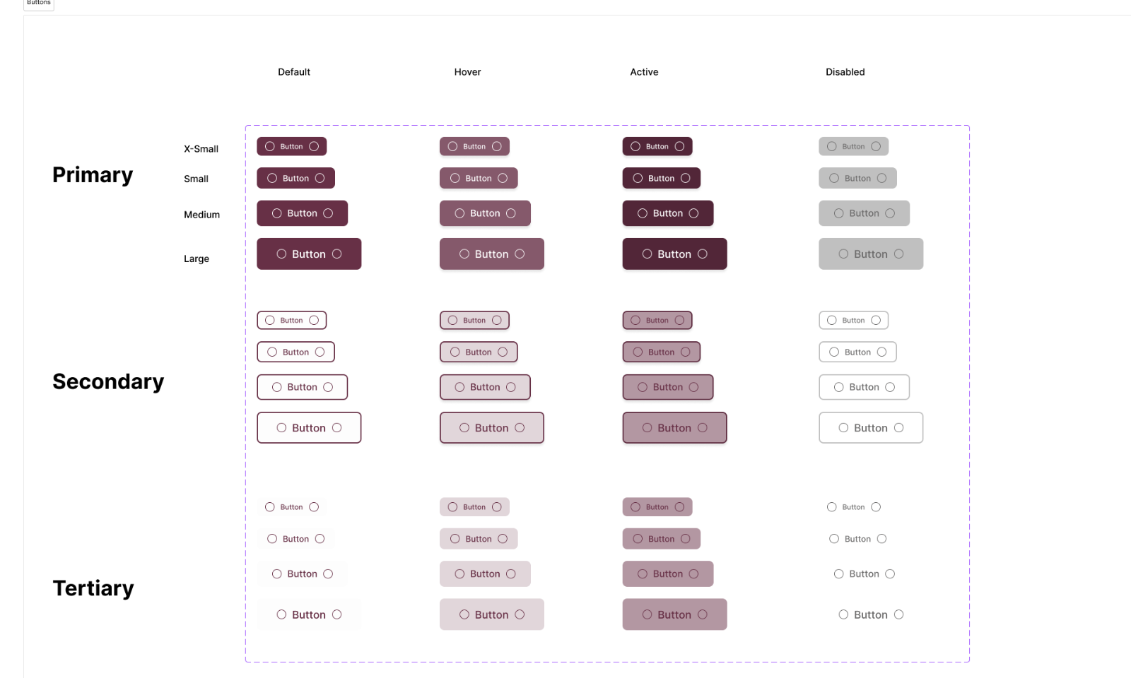
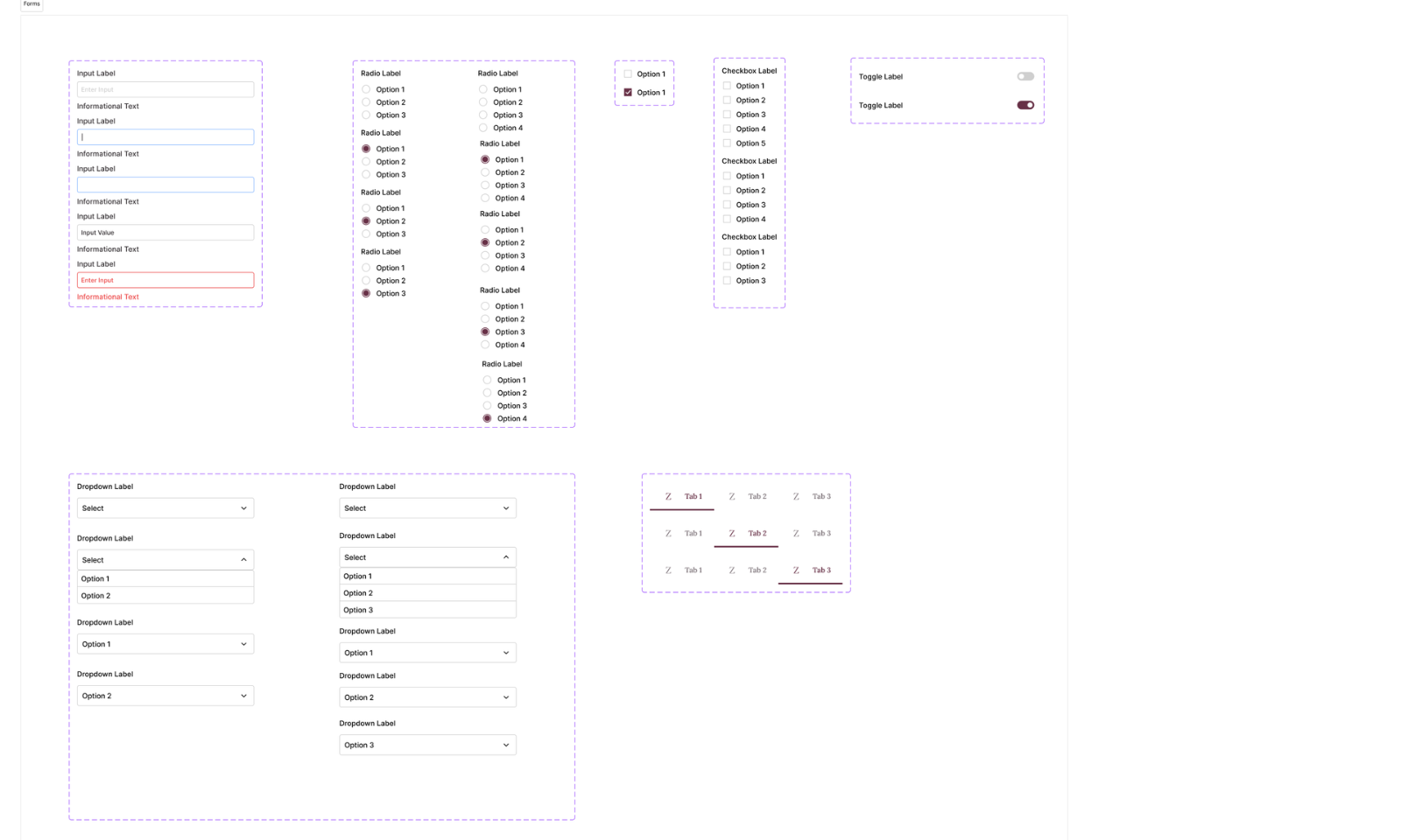
Every component was designed with four interaction states: default, hover, active, and disabled, across three hierarchy levels: primary, secondary, and tertiary.
Buttons
 images/zyra/zyra-buttons.png
Forms & Controls
 images/zyra/zyra-forms-controls.png
Icon system
Iconography Specs
Figma file
Explore the full Zyra design system.
Open the Figma file to view the complete foundations, components, iconography, and website UI.